NYU Shuttles: Instant Transit Tracking & Guidance
An app redesign providing bus schedules and live location tracking, helping students get around New York City efficiently.
Timeline
4 weeks (Nov-Dec 2023)
Team of 3
UX/UI Designer (me)
Project Manager
UX Researcher
Disciplines
UX/UI Design
UX Research
Tools
Figma
MOTIVATIONS
The shuttle section of the NYU Mobile app has been notorious for years due to its poorly designed UI and unreliability.
Rather than an app specifically for NYU shuttles, the university uses an embedded webpage from the Passio GO app.
Unfortunately, many people are discouraged from taking the shuttles—a free resource that the university provides—due to difficulty with the UI, frustration with wait times, and high effort compared to alternatives like NYC subways.
🚏🏃🏽🚦
PROBLEM
Understanding Product Vision
Users
NYU students and staff face difficulty finding key information about school shuttles such as schedules, live ETAs, routes, and stops.
Our Opportunity
People need quick, intuitive, and reliable shuttle bus tracking in order to effectively use NYU’s transit resource.
Since there is an existing UI that users can give feedback on, it provides a great starting point for us to learn from 🚀
EXISTING USER TESTIMONY
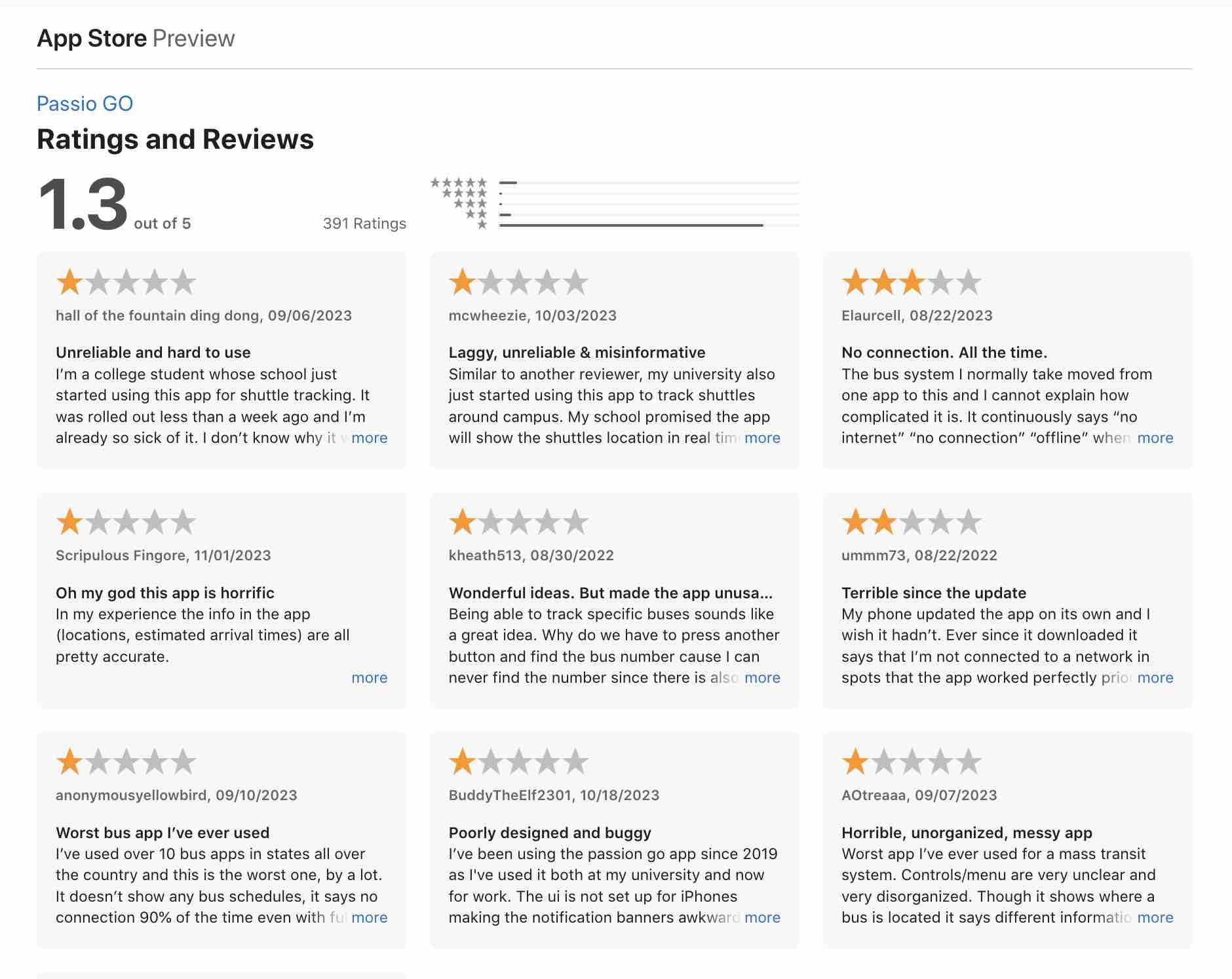
The App Store’s reviews give us a revealing window into grievances about Passio GO. With an overall score of 1.3 out of 5 stars from over 350 ratings, it’s clear that the vast majority of users have an unpleasant experience and aren't able to accomplish their goals with ease.
Controls/menu are very unclear and very disorganized.
The buttons are also difficult to press as they are very small.
Navigating around the map is impossible to do without accidentally triggering some menu.
The UI is not set up for iPhones making the notification banners awkward and difficult to utilize.
I just want to know when my bus is coming and this app makes things so much harder.
Worst app I’ve ever used for a mass transit system.
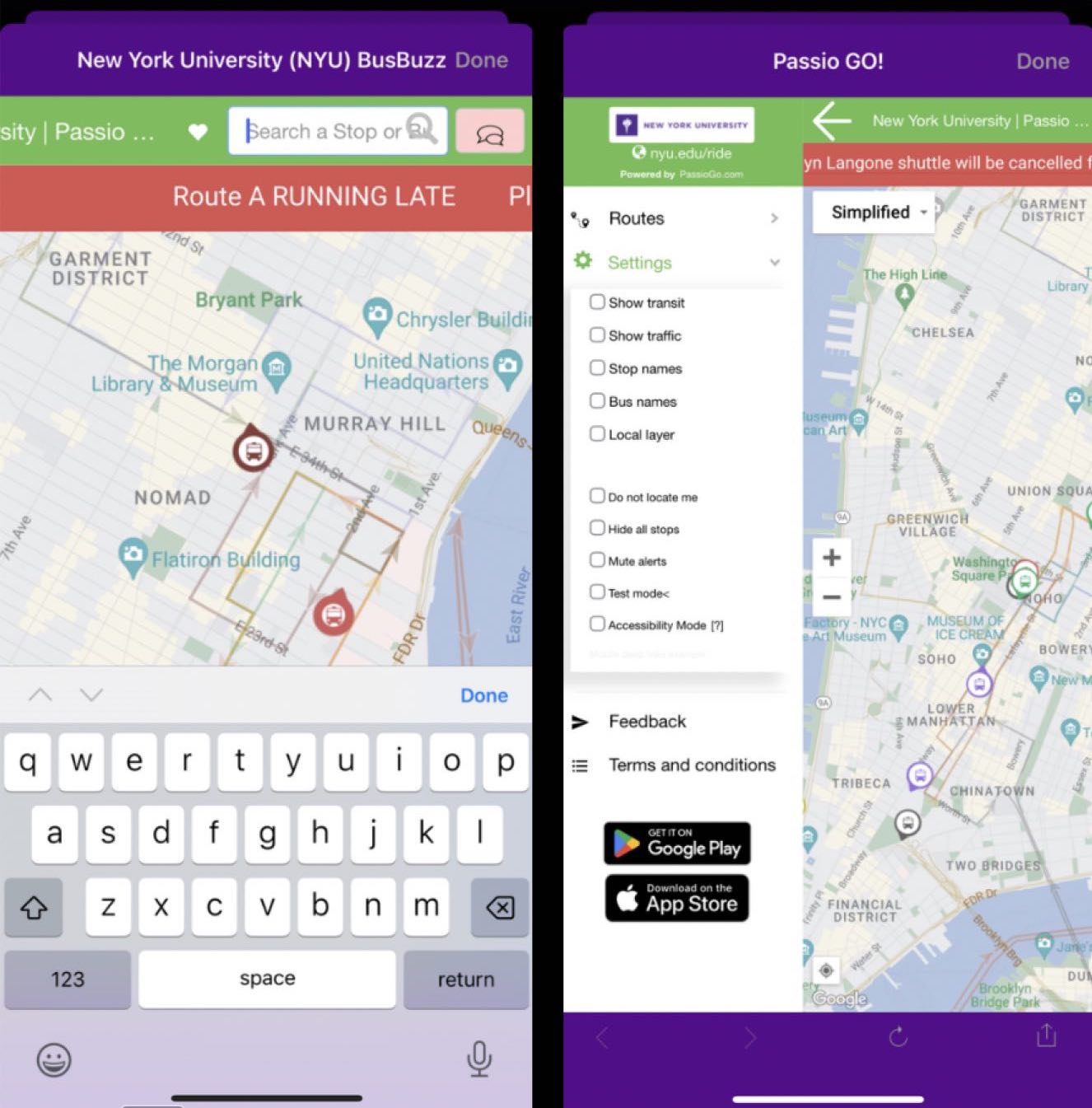
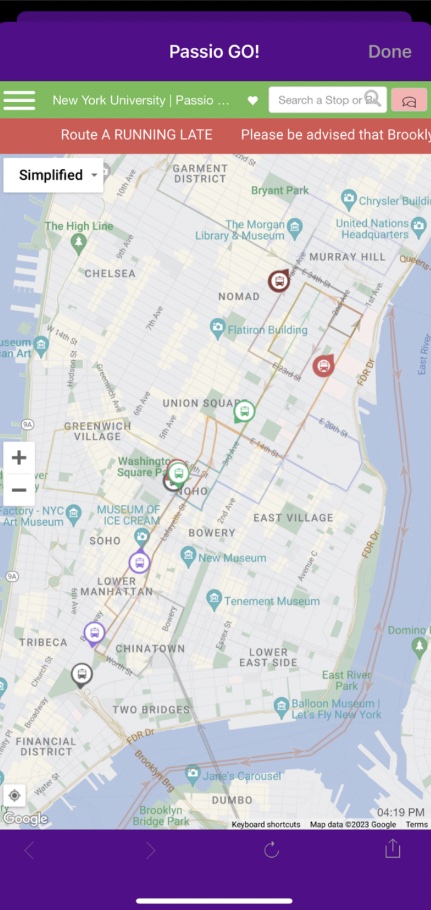
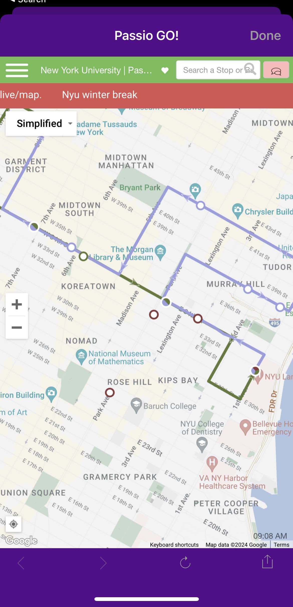
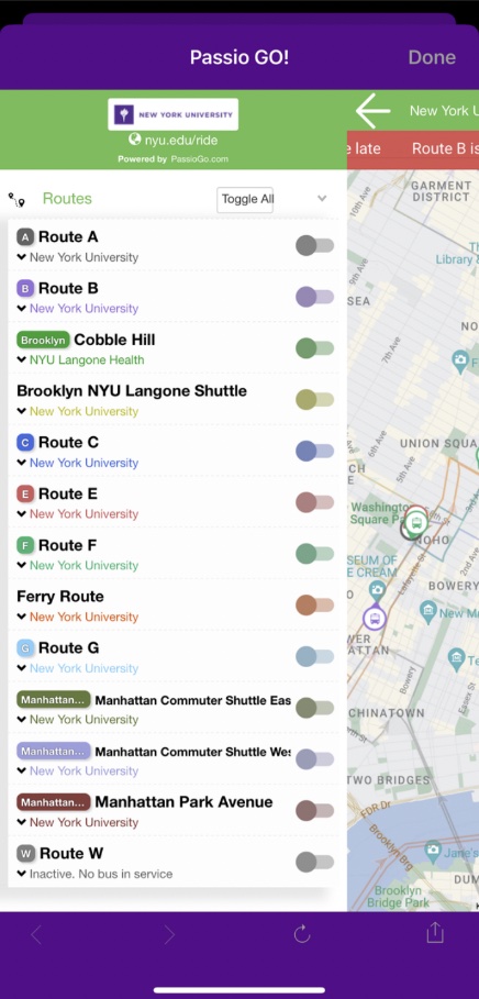
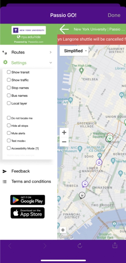
THE CURRENT UI
Addressing the Immediate Issues
Before diving into user research, we can point out some usability issues in the current design that will be prioritized in our solution.
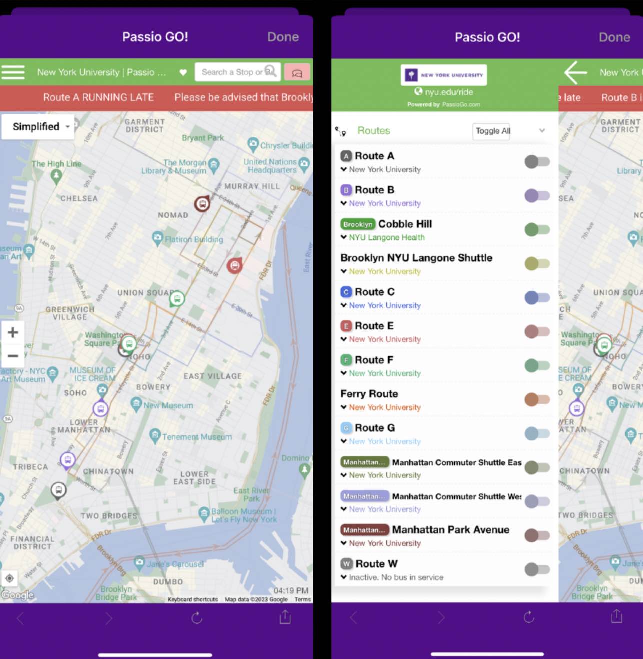
UNCLEAR ROUTES
On the landing page, users are met with a map with all shuttle routes outlined—but the lines are very faint, thin, and hard to distinguish from one another.
COMPLEX TOGGLE ACTION
A toggle can help isolate a route, but it’s hidden in a hamburger that doesn’t intuitively indicate the action. When opened, a sidebar covers almost the whole screen and prevents the user from viewing the map—making it a tedious process to toggle + view routes.
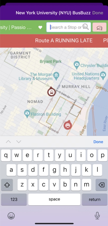
UNUSABLE SEARCH
A search bar exists, but it doesn’t allow users to search addresses or destinations—only stop names, perfectly spelled.
EXCESS FEATURES
The map includes a number of options that have an unclear purpose, such as “satellite view,” “show traffic,” and “test mode,” which only seems to clutter the UI.
In addition to an alert banner, there is also a misleading chat icon that opens a notifications tab.
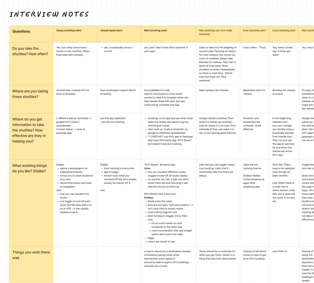
USER RESEARCH
Understanding Our Audience
We conducted interviews with 8 current and former users of NYU shuttles with the current app in front of them to get a deeper understanding of our problem.
*I contributed to this research in both planning and conducting user discovery interviews
Key Insights
We found that users tended to travel to and from their apartments/dorms and NYU buildings, but sometimes also to other destinations like stores or friends’ apartments.
Dislikes & Frustrations 😐
- Needing to use multiple apps for sufficient info (Passio GO, Google Sheets for shuttle schedules, Google or Apple Maps for traffic)
- No user guidance to destinations, causing them to feel overwhelmed
- Unnecessary, confusing, or unexpected features
Liked Features 🌈
- Color coding and instant route visualization when app is opened
- Live tracking of upcoming shuttles
- Toggle / ability to view routes in isolation, although many users voiced that it could be improved
Core Issues: Discoverability & Usability
The majority of users are only occasional riders of the shuttles who cite both the inconsistency of the physical shuttles and the confusing app as reasons why they don’t use it more.
When asked about features they’d like in an ideal shuttle app, users listed many already-existing tools (route toggle, search, set a destination) that were either nonfunctional or that they didn’t realize were there. This emphasizes how crucial discoverability will be as we brainstorm design solutions for our problem.
INTERVIEW PREVIEW
Do you take the NYU shuttles? Where do you typically take them? How often?
Where do you get information to take the shuttles? How effective are they in helping you?
Is there anything you wish was in the shuttle bus app that’s missing?
IDEATING A SOLUTION
Using Data to Inform the Product
Brainstorming
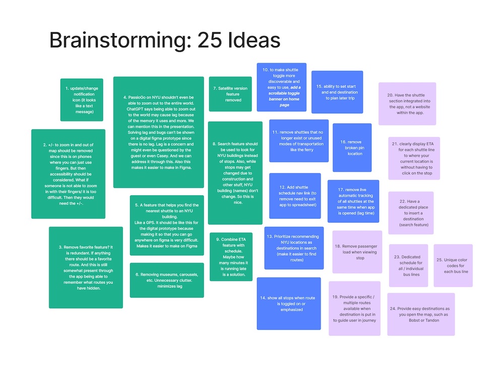
My team of 3 engaged in an ideation exercise where we generated 25 unique ideas—big and small—to solve our problem at hand.
Recognizing that much of users’ comfort and ease can be aided with familiarity of a product, we researched popular transit apps and their interfaces to get inspiration from design elements that have been extensively tested and shown to work for people.
We referenced the apps Citymapper, Google Maps, Transit and Apple Maps.

Rough Sketches & Ideation
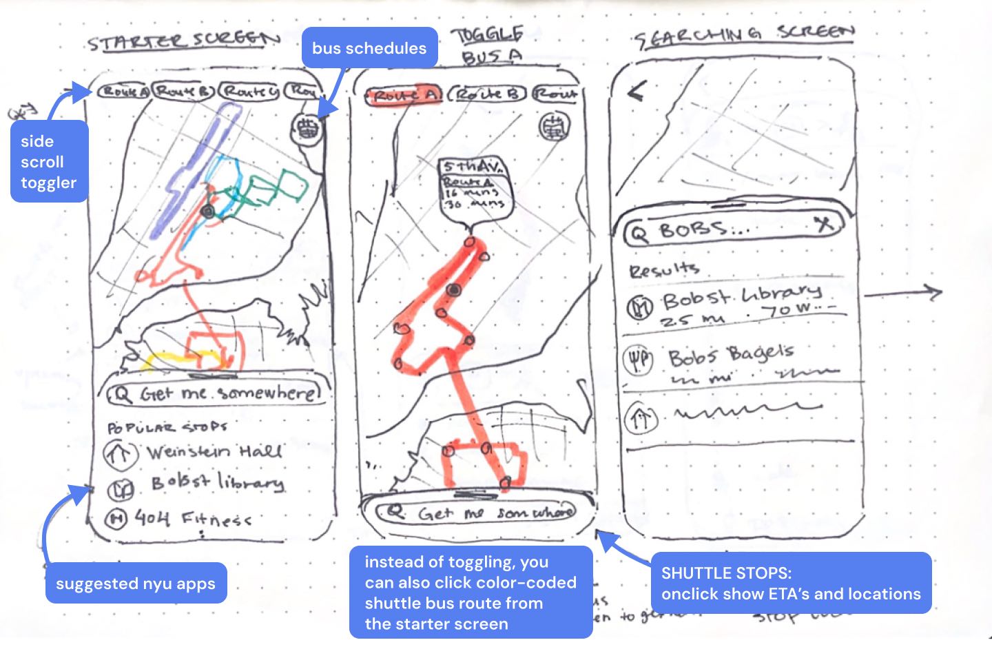
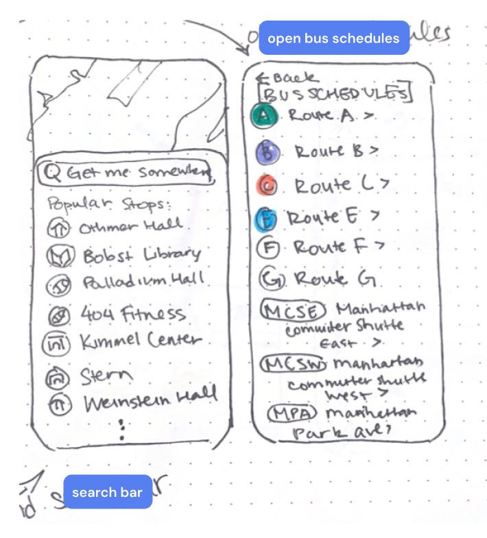
User Flow
USABILITY TESTING
Paper Prototype Testing
To validate our design ideas before moving forward to higher-fidelity prototypes, we decided to conduct some user testing with paper prototypes to ensure that we were meeting our goals.
*This testing was conducted by me with the the researcher taking notes during interviews.
What worked for users 🙌
- Redesigned toggle (now a horizontal scrollable header directly on the map)
- Shuttle schedule button
- Intuitive screen icons
- Color coded routes
- Familiarity of UI to other map/transit apps
Feedback for next iteration 🔄
- Implement inactive and active button states
- Emphasize that toggle buttons are interactive/clickable
- Simplify transit options (keep focus on NYU shuttles rather than all public transportation like MTA to avoid confusion)
- Stronger NYU theme + colors
SOLUTION
Our Central Priorities
🗓 Accessible Shuttle Schedule
📍 Pre-Set NYU Location Options
🧭 Full Travel Guide from Start → Finish
💡 Readability & Discoverability
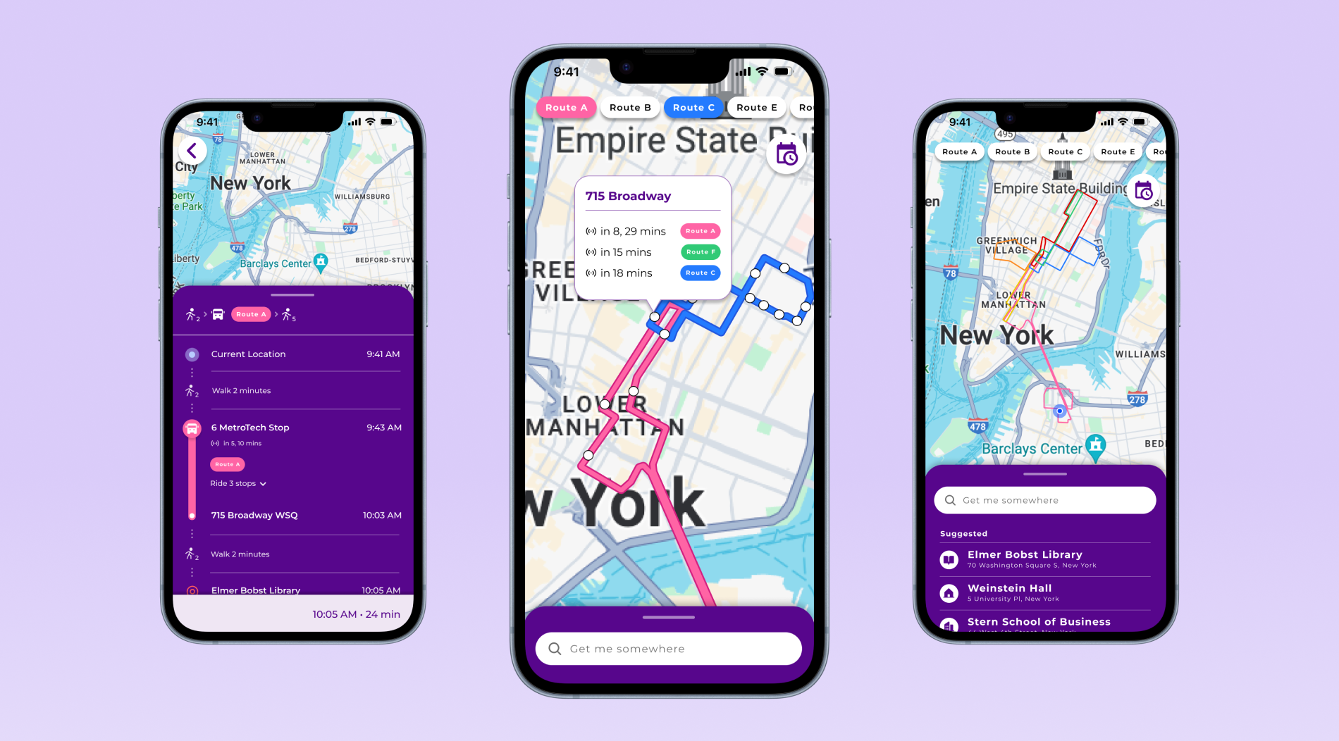
FINAL PRODUCT
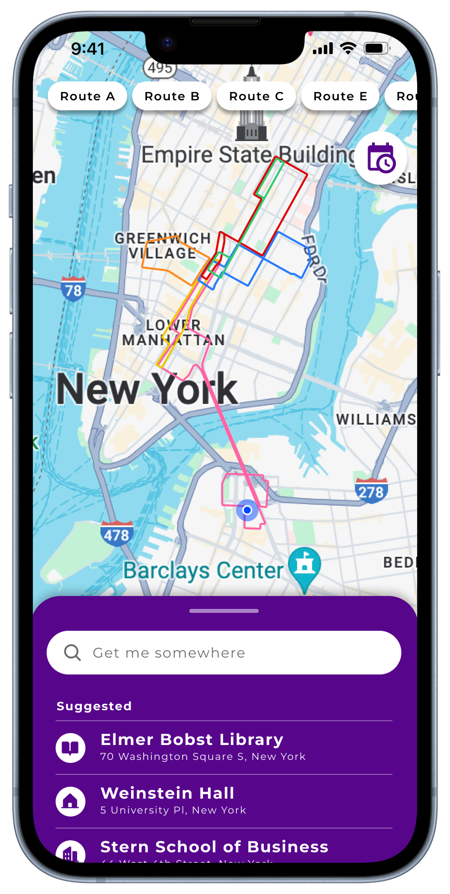
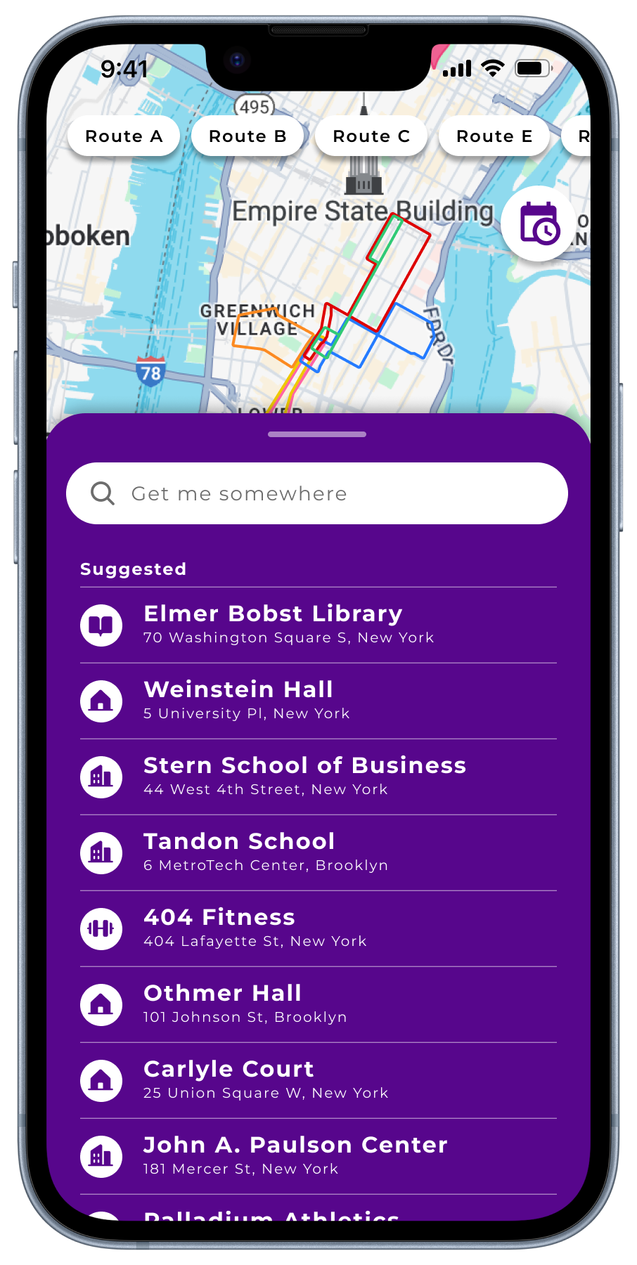
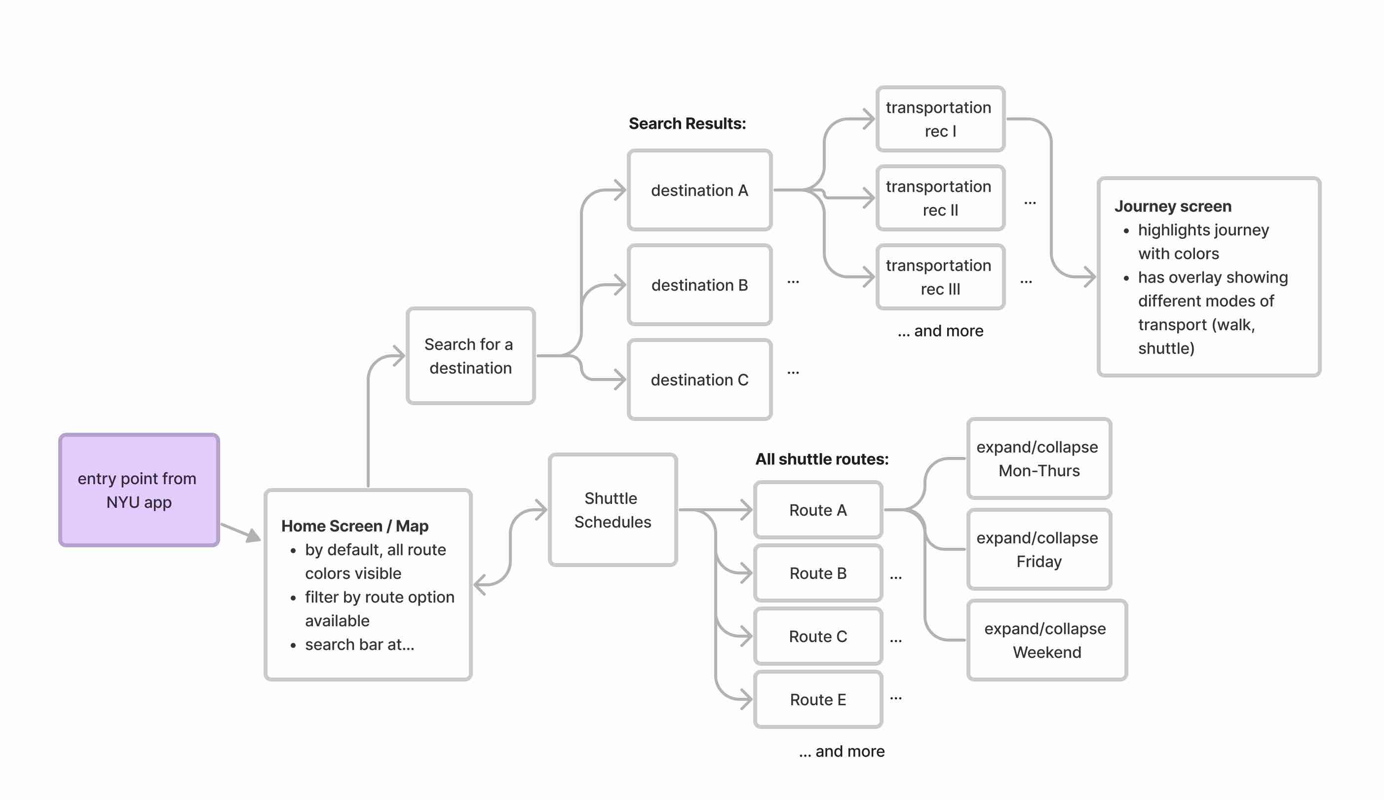
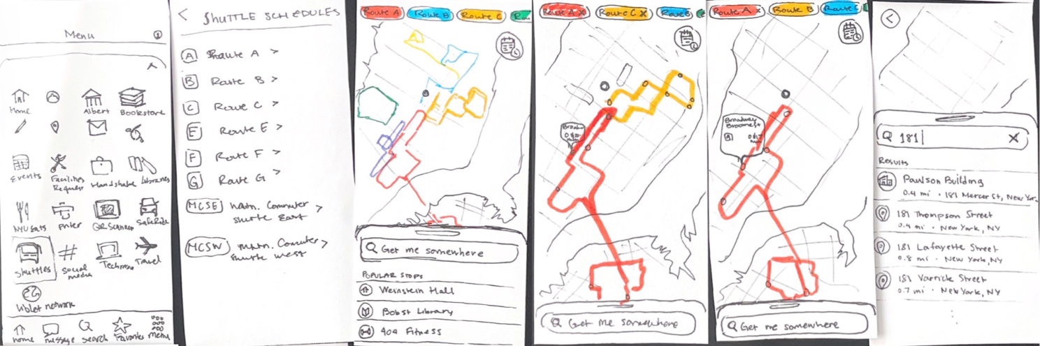
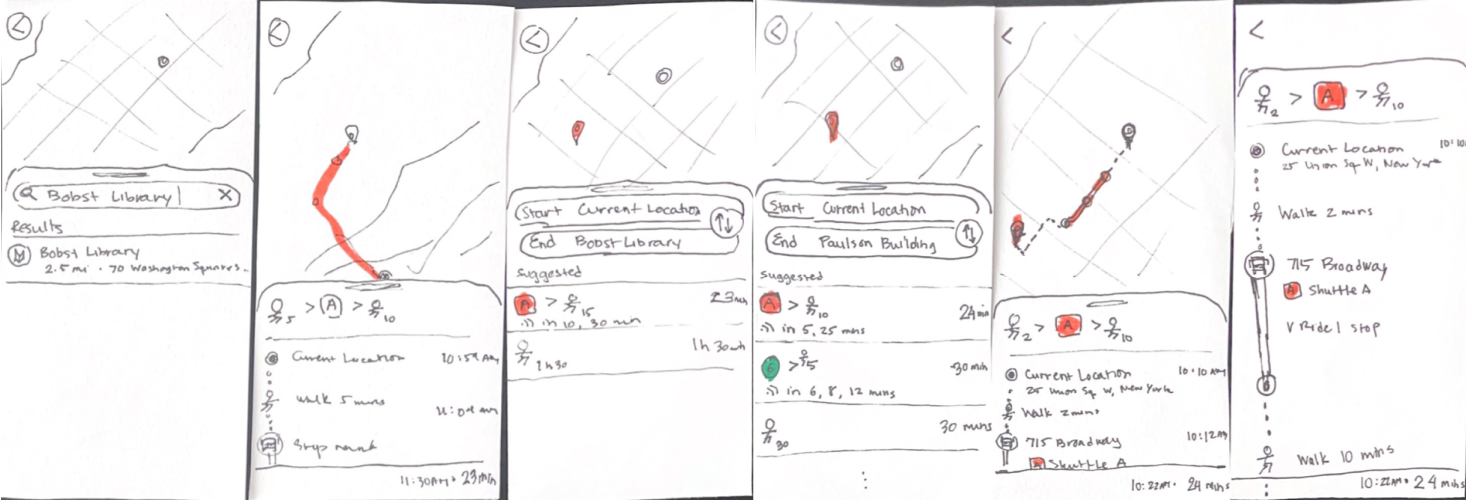
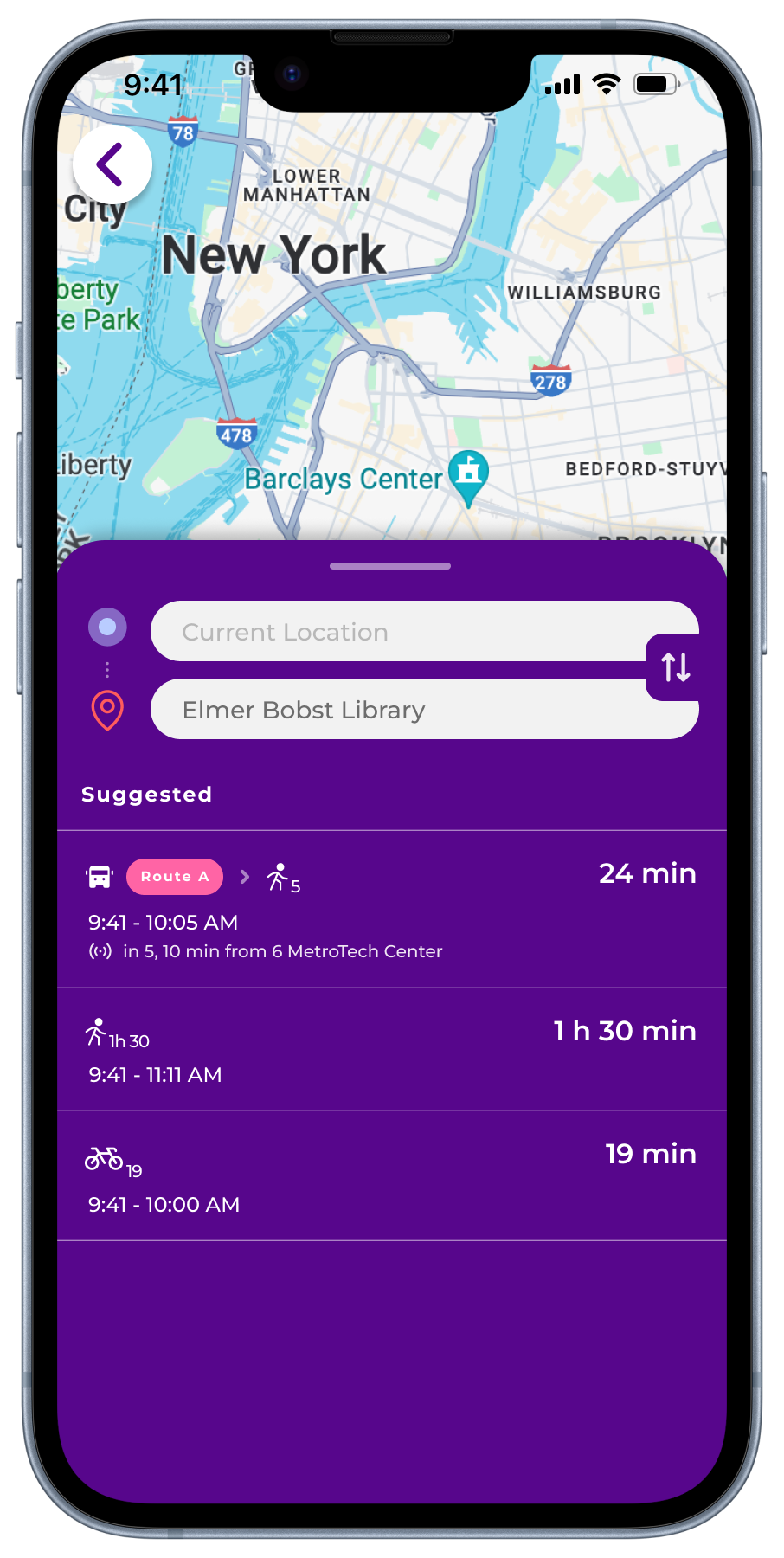
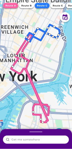
Landing Page
The landing screen features a map with all routes outlined in different colors, a bottom sheet with a search bar, and a header with a toggle and schedule button.
Expanding the bottom sheet reveals a list of suggested NYU destinations for optimal convenience.
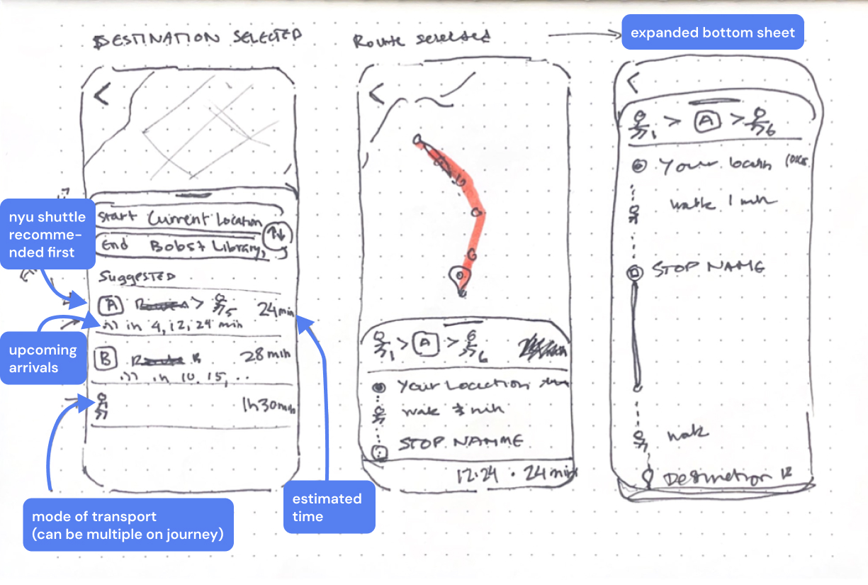
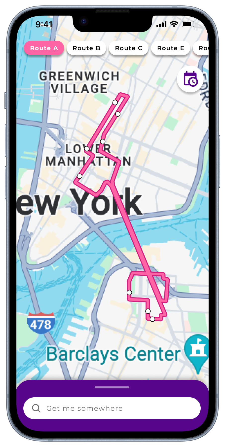
Route Toggle & Live Tracking
There are 2 methods to toggle/emphasize a route: clicking on the route itself or interacting with the header buttons. Users can even visualize multiple routes.
The toggled state offers a more detailed view with stops, which you can expand to view details about upcoming shuttle arrivals.
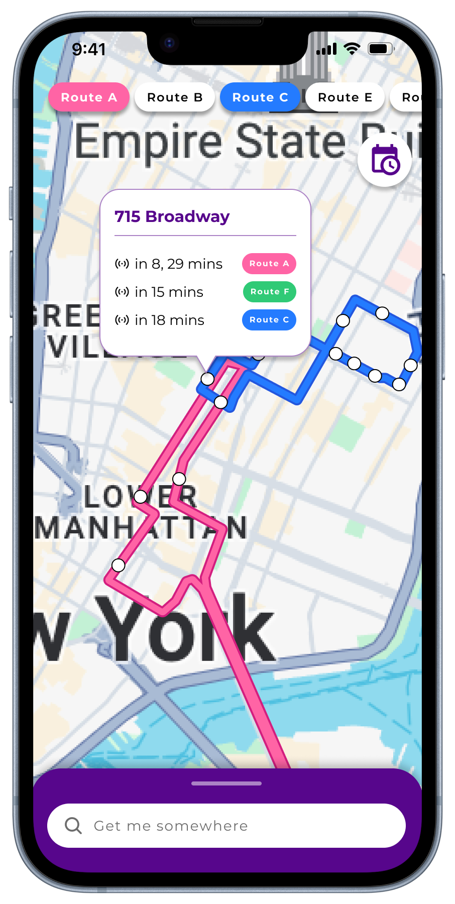
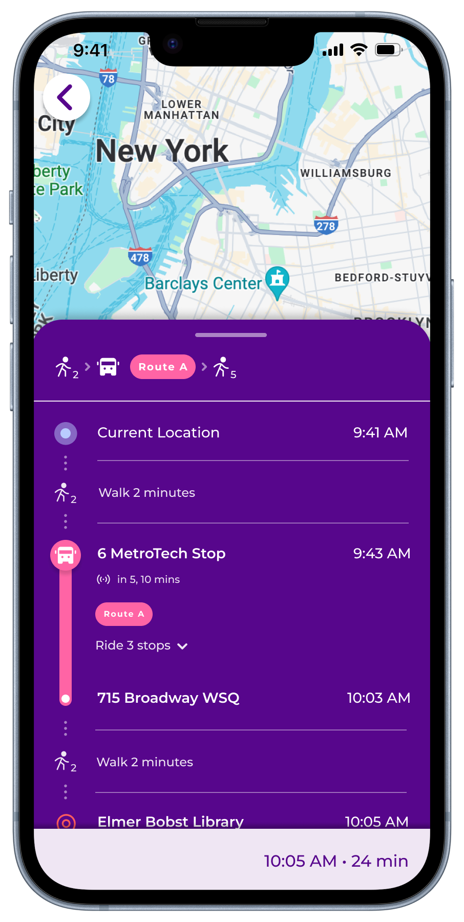
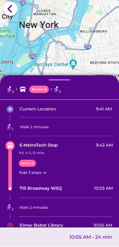
Comprehensive Journey Guide
A toggled route offers a more detailed view with stops. Clicking one triggers open a popup with the stop name along with upcoming shuttle arrivals.
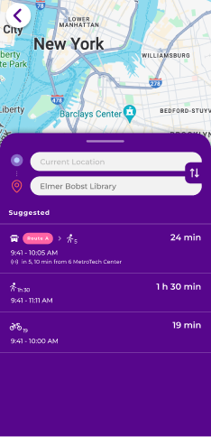
Refined Search Engine
We updated the search mechanism and added a recent search history to reflect more conventional flows and create a stress-free, familiar experience for users.
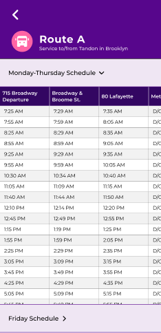
Integrated Shuttle Schedules
We solved one of the most common frustrations for users—having to open Google Sheets alongside the shuttle app—by making shuttle schedules accessible in-app through a nav icon on the landing page.
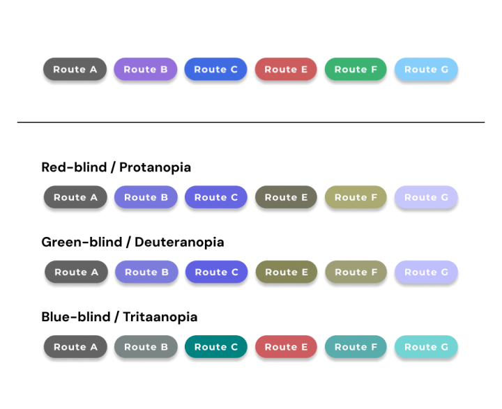
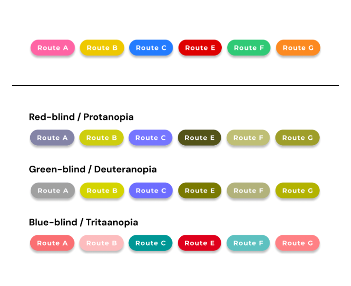
ACCESSIBILITY
Accommodating Colorblind Users
In a transit app that relies heavily on color to communicate important information, it was essential that we considered accessibility in our choices.
Using the Colorblindly Chrome plugin, we viewed our shuttle route colors in various colorblind filters to ensure that they were both high contrast on the map and differentiated from one another.
We were also fortunate enough to test our prototype on 2 colorblind users whose feedback helped us iterate.
Old colors (Passio GO)
Updated colors
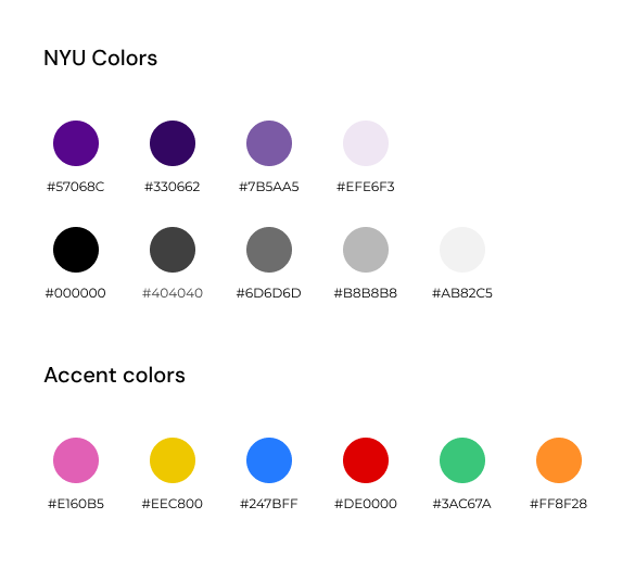
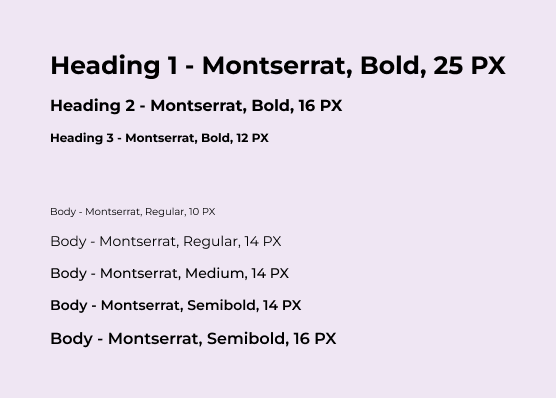
STYLE GUIDE
We adhered to NYU’s style guide for this design, adding accent colors where it was necessary for understanding. Montserrat is the free alternative for NYU’s primary typeface, Gotham.
BEFORE & AFTER OF THE UI
PREVIOUS SCREENS
THE GLOW UP 🤩✨
I would totally use this, it’s so much better than what we have.
We should get a dev team on this.
I want this in NYU’s app so I can use it every day.
REFLECTION ⚡️
This project was conducted during finals week, so time constraints unfortunately won this time. But, given more time on this redesign project, I would have seized the opportunity to do more research into prototyping designs on maps.
There was a fair amount of restriction associated with Figma’s toolbox when it came to prototyping this project. While I wanted to implement many of the common map interactions like zooming in and out, many were not possible or optimized in the Figma software. By gathering more information, we could gain insights from industry best practices regarding map UI prototyping and identify potential areas to learn and grow from. It would also help us further develop screens associated with the map in a more efficient, effective way.
Furthermore, I would have loved to conduct further testing, especially in the higher-fidelity prototyping stage. This could include usability testing or surveys to gain a deeper understanding of users’ preferences or additional features they want’d to see in a redesign. This user-centric approach would provide valuable insights for prioritizing design enhancements and aligning the redesign more closely with user needs and expectations.