INTERNSHIP || Improved personalization and organization in the iHeart app library for saved radio, podcast, and music content to increase engagement and listening.
Duration
5 weeks
Jul-Aug 2024
Team
Me (UXD Intern)
Aj Karaca (UX Lead)
Kimberly Hall (PM)
iOS Engineers
Disciplines
UX Design
User Research
Tools
Figma
UserTesting
Adobe Analytics
Excel

Parts of this project are hidden under NDA
During my internship, I partnered with another UX designer in a design sprint that aimed to improve the Library experience on the iHeart app. I led the cross-functional collaboration between product management, UX research, engineers, and analytics to deliver a design proposal.
Design responsibilities: Wireframing, UX Audit, Competitive Analysis, Low to Hi-Fi Prototyping
Research responsibilities: Research Planning, Unmoderated Testing, Quantitative Analysis, Qualitative Analysis
Why redesign the Library?
iHeart’s engineering team is undergoing an initiative to rewrite the mobile app in Swift for an
improved infrastructure to repair bugs and add new components. The UX team therefore is using
the opportunity to improve key areas of the app, including Library.
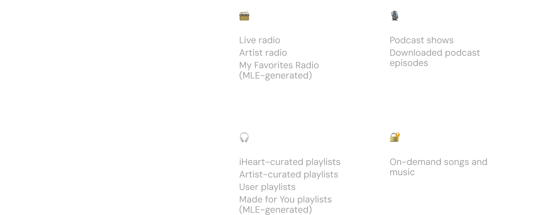
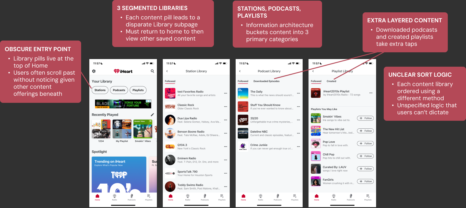
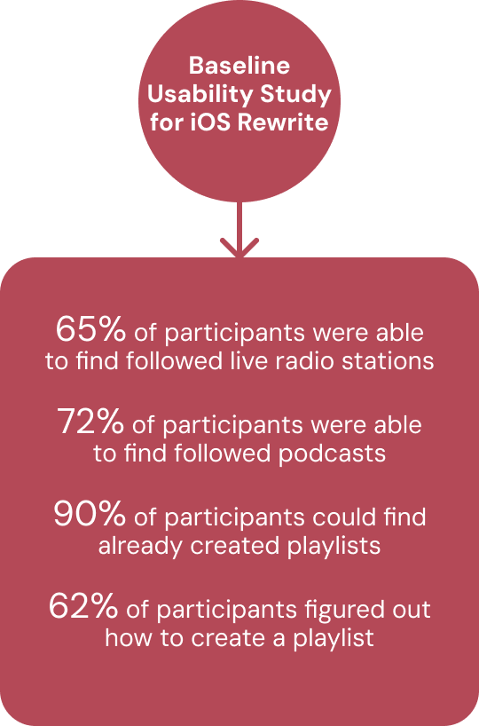
Before identifying the problem, it was important to document the current experience
and the audio content types we need to consider.
Understanding Product Vision
Library is an area of the iHeart app that is widely neglected. Users face difficulty efficiently accessing and organizing content they have saved.
People need a dedicated space for their saved and created content that is tailored to reflect
their interests, preferences, and unique interactions. It should be engaging and easy to navigate,
organize, and manage based on user preferences.
Since we have tracked analytics and a pool of existing research, it gives us a great starting point
to learn from 🚀

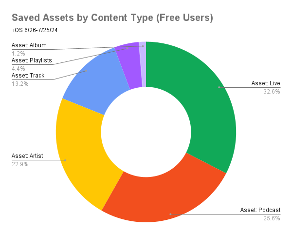
From our iOS data gathered on Adobe Analytics from June to July 2024, we uncovered that:
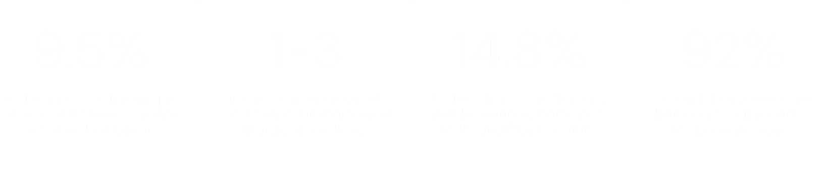
Few of our unique visitors—only 9.5%—have something saved in Library. Within that group, the vast majority have very little saved: around 82% have between 1-3 assets. This indicates there is something about Library that is not enticing users to save more.
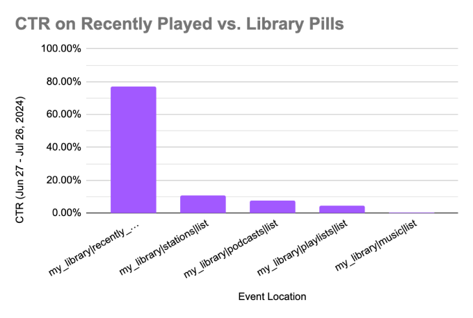
The Recently Played carousel and Library both serve as areas on Home where users can access content
they have previously played or demonstrated interest in that are not associated with content discovery.
Recently Played has a CTR above 75%, while the Library entry points’ CTRs are all below 15%.
This discrepancy suggests that Library is an area of potential where we can
offer what users are seeking as shown by Recently Played.
The metrics discussed here can be explained by a variety of reasons (e.g. how users save content, feedback when saving content, the Library entry point, or even a combination of multiple) beyond just the internal organization/design of Library. For this particular initiative, our scope was the latter. Although this data cannot exactly identify the root cause of the low engagement, it still provides useful directional insights.
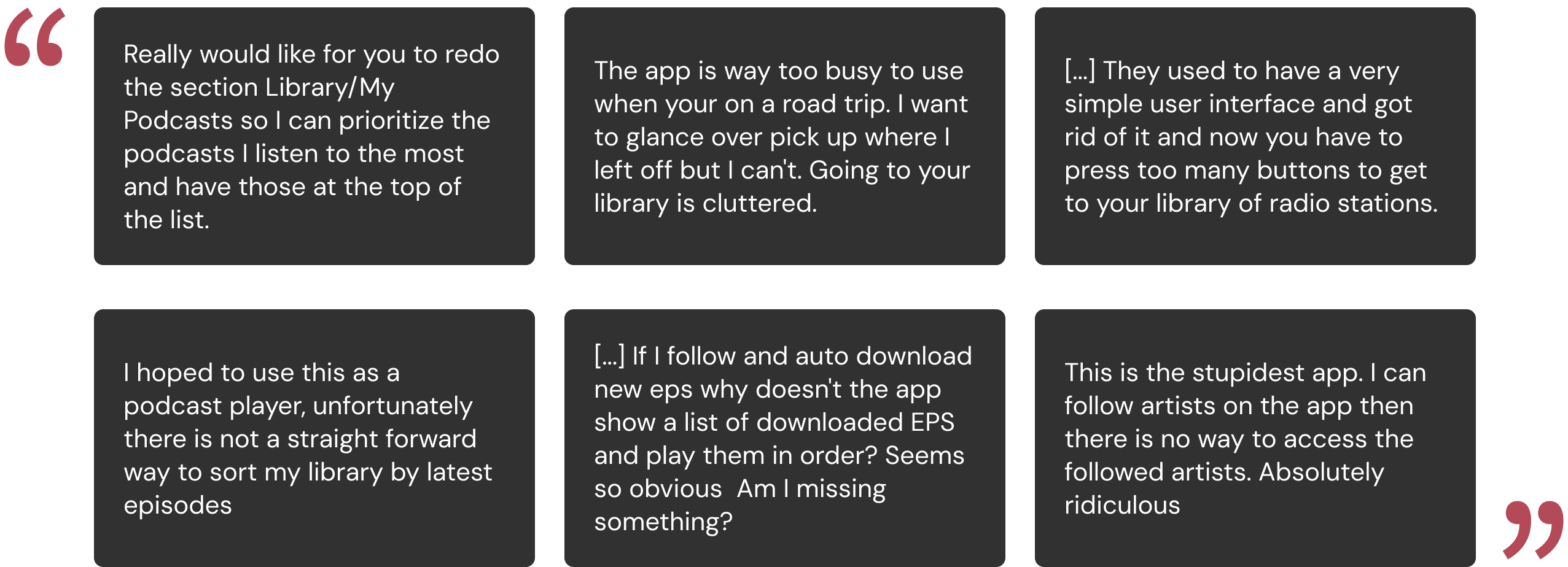
I also reviewed user feedback through data.ai and App Store reviews to develop a better understanding of user pain points and areas of
confusion concerning Library.
Common threads included the (1) difficulty of getting to saved content and (2) how cluttered
Library is.
Users mentioned the order of displayed content not being relevant to their wants and the excessive
number of taps needed to reach assets. We also observed a frequent mismatch in mental models, as even some users
failed to locate certain content (e.g. Artists, Downloads).
The UX Research Guild previously documented findings about the current app that underscored the difficulties described
by users about locating saved content across all categories.
This also revealed to us something user feedback alone did not: we were missing a key opportunity area regarding the
‘Create a Playlist’ functionality. According to product research, users who create a playlist have average month 1 retention rate of 89% vs. 76% for users who
do not create a playlist (Redshift).
What is the competitive landscape?
With a foundational understanding of Library problem areas and user pain points, we then investigated iHeart’s positioning among audio, radio, and podcasting competitors.
Reviewing competitors provided us valuable insight into how they approach structuring their users’ saved content, since
each has different content offerings.
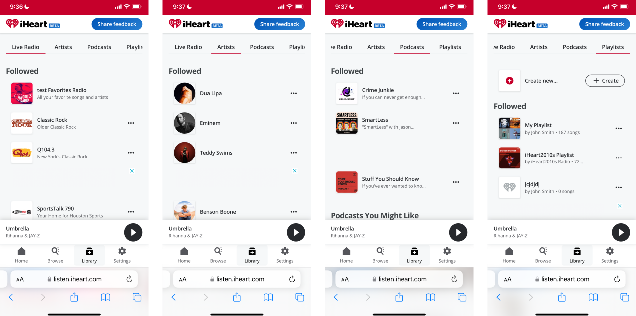
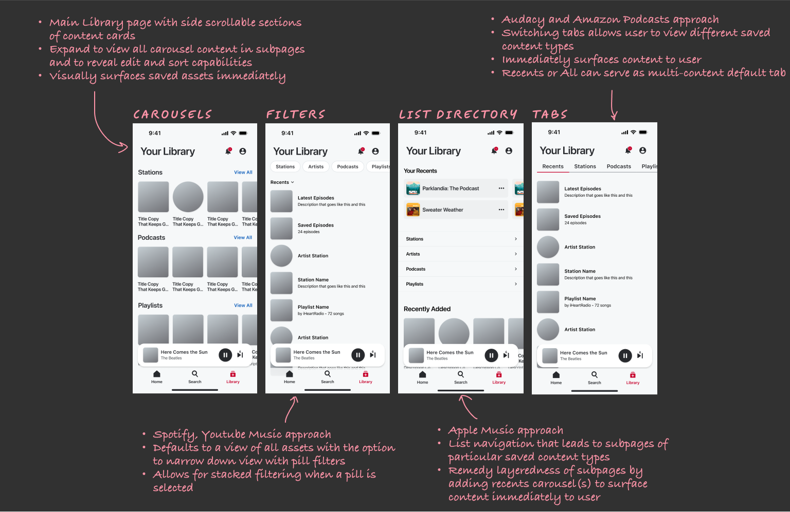
Among 8 competitors, we observed 3 different types of navigations: list directories, tabs, and filters.
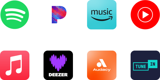
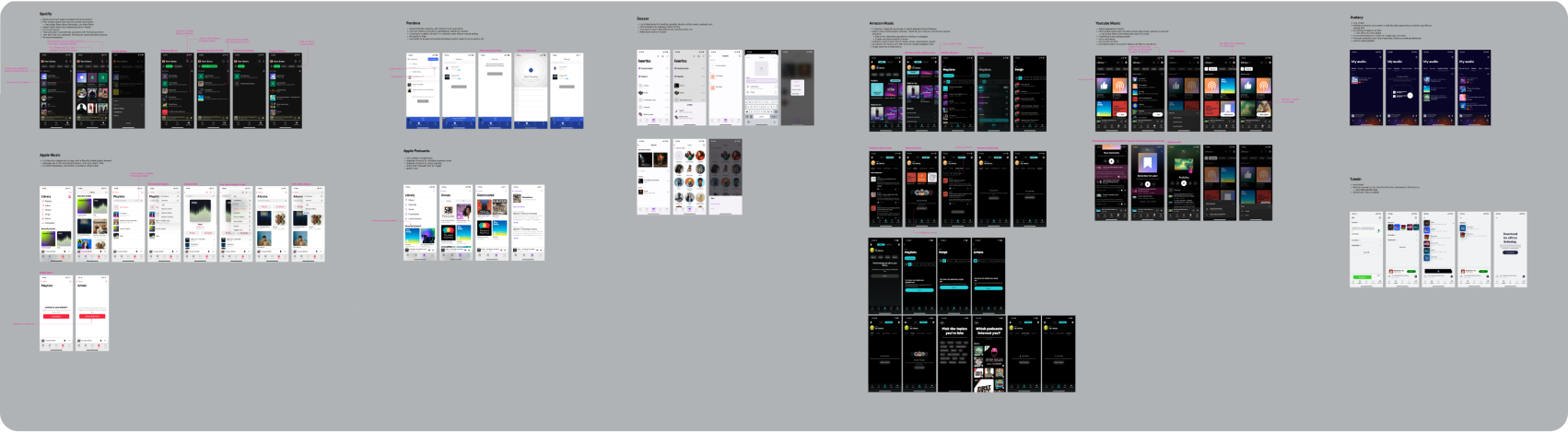
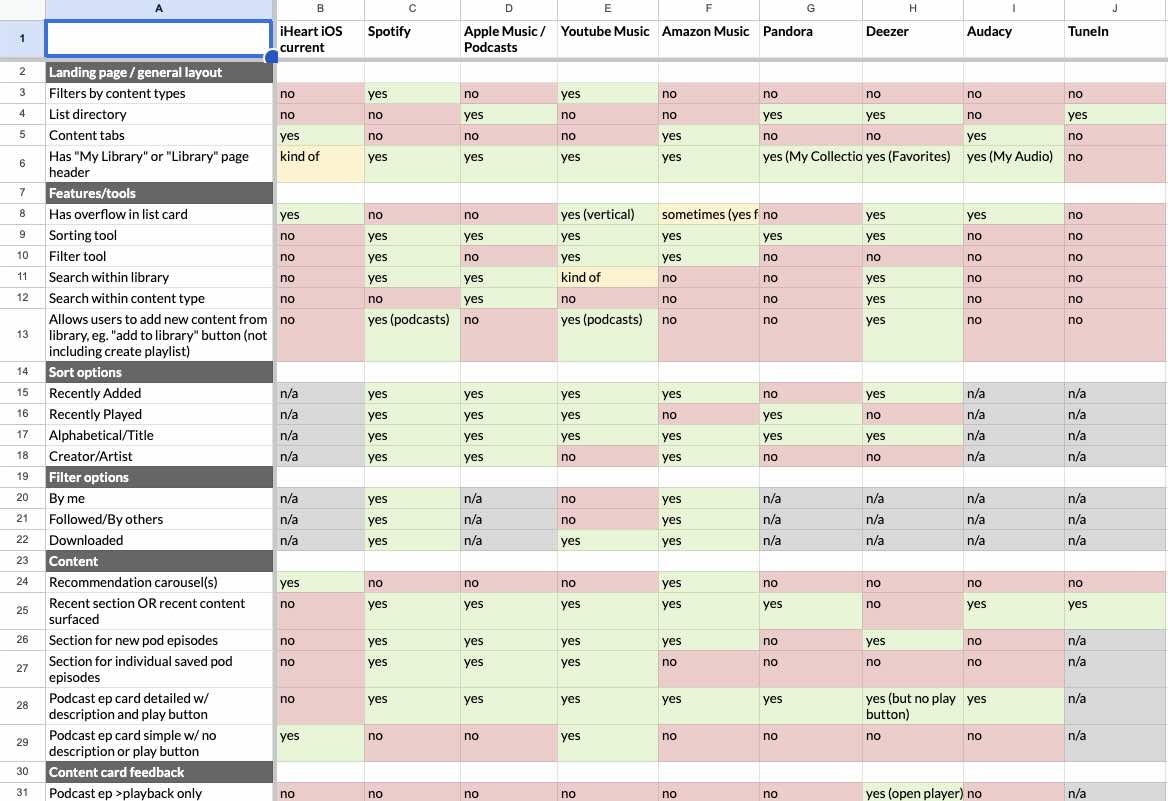
We also compared features between each, which helped illustrate how iHeart is different and which areas we can take
inspiration from.
We noted in particular different sort/filtering capabilities and recent content being surfaced—features iHeart lacks.
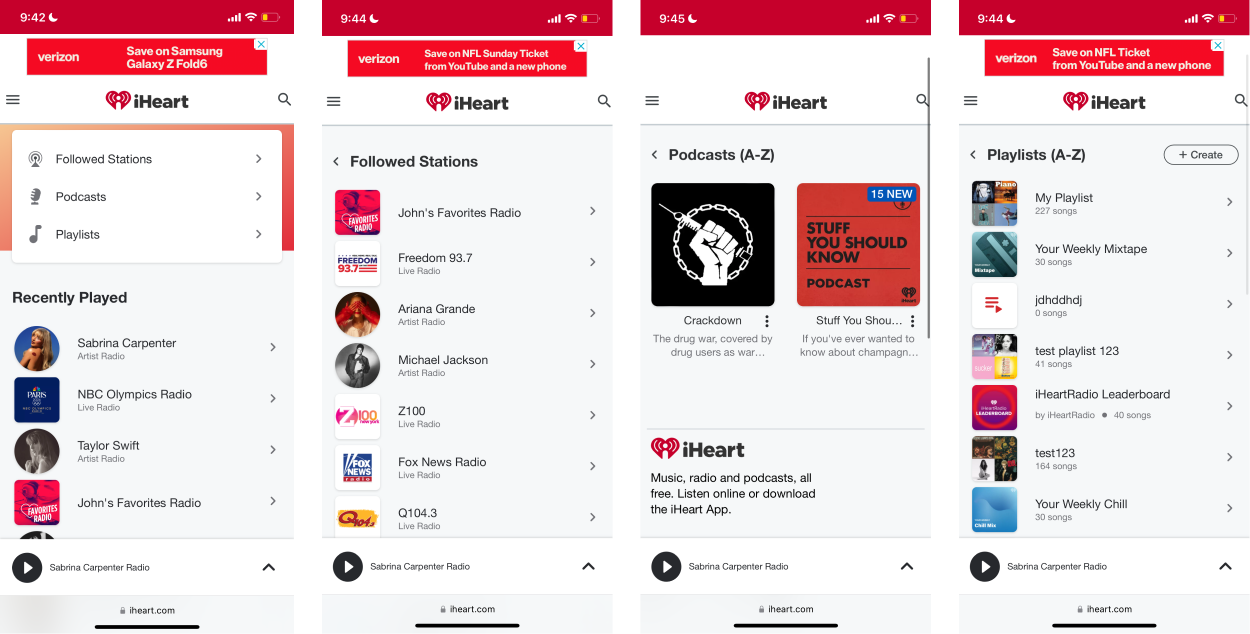
Lo-fi Wireframes / Rapid Prototyping
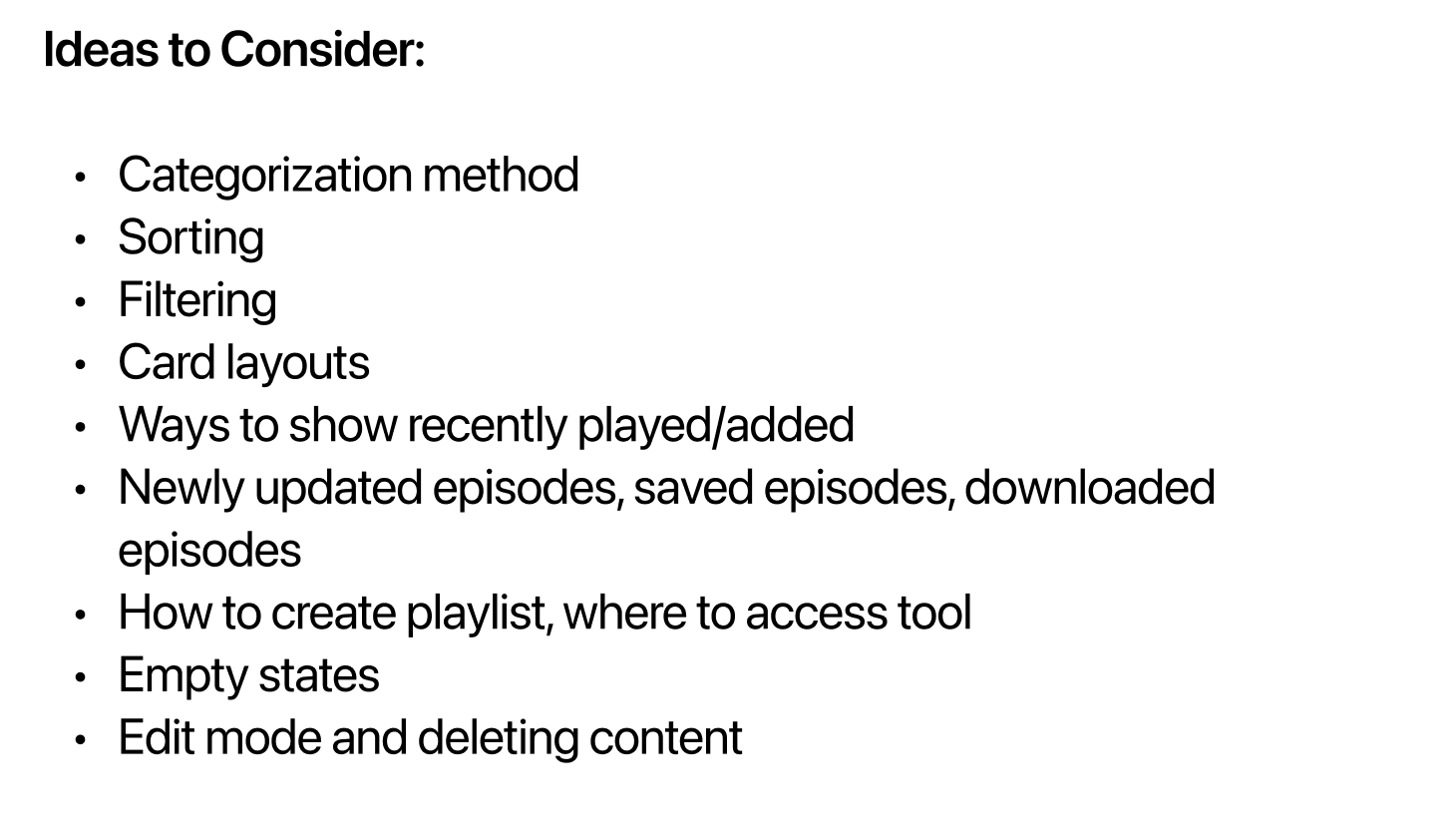
In the ideation stage, I aimed to generate as many ideas as possible given the pain points we wanted to address. We experimented with different high-level navigations and categories, considering different use cases and all iHeart content types. We focused on:

Organized & Intuitive Structure
Reducing Steps to Reach Content
Sorting Capabilities
Surfacing Recent Content
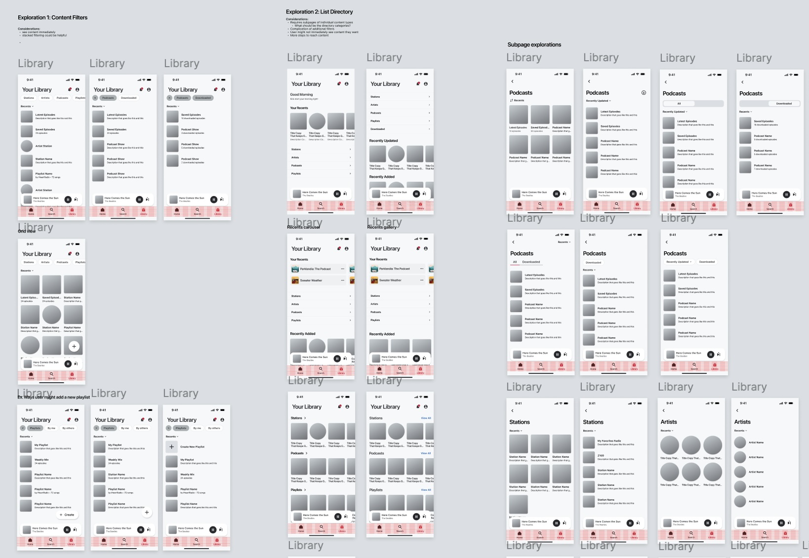
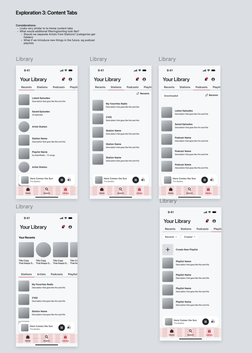
We explored high-level navigational structures and information architectures, creating variations of the following explorations:
💬
We held several critique sessions with UXD and stakeholders in the early stages of designs to capture all relevant considerations and missed use cases.
🧠
Consulting with subject matter experts and iterating on a wide variety of lo-fi wireframes allowed us to identify which ideas to eliminate or explore further.
Both these navigation structures were sidelined for not improving the issue of how layered Library is. With the carousel structure, it was impractical to give users ways to organize or sort without resorting to subpages, and it also resulted in problematic empty states.
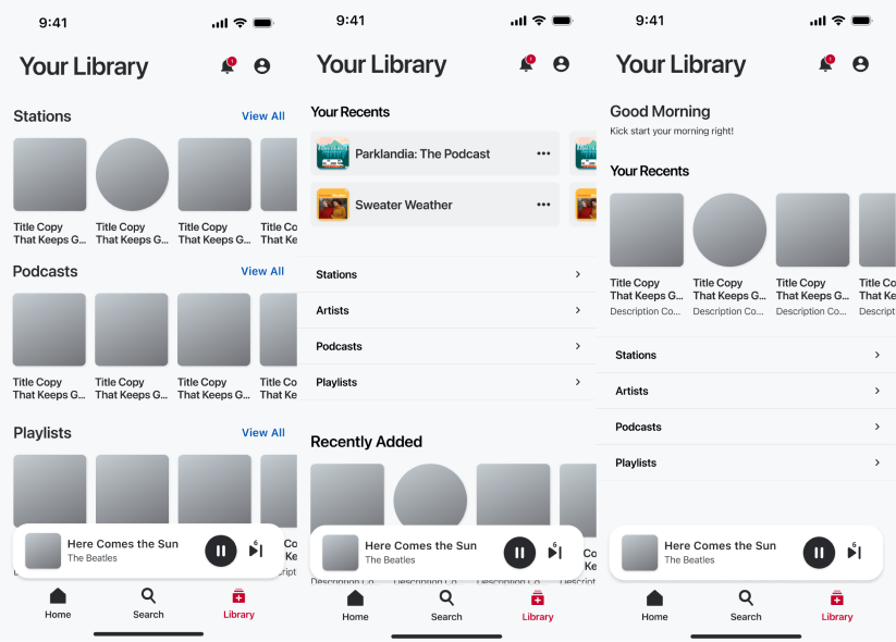
The All view rose up as a strong candidate because of what we know about our users generally saving only 1-3 items.
It was important therefore to reduce steps to reach this content and immediately surface assets to users upon entry
to entice them to engage.
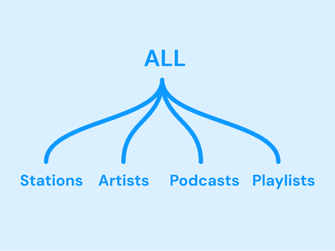
While we considered behavioral categories like “Recents” and lower-level content categories like “Saved episodes,” these could not support future Library changes. Conversely, a high level content-based architecture (Stations, Artists, Podcasts, Playlists) is generalized enough to accommodate for many content types and scale.
Sorting is necessary for defining logic in multi-content lists and to empower users to organize their assets according to their preferences.
We documented extensive feedback requesting a sorting ability in Library, and there appears to be a user expectation tied to it too. Among
competitors, 6/8 have sorting and 7/8 surface recent content in the Library.
Validating Our Ideas
Given the strengths of a default All view, sorting capabilities, and content-based information architecture, we narrowed down our designs to
2 top-level navigational structures (filters and tabs) that could support these criteria.
This led us to a stage where we had concrete questions that could be answered with testing, so we collaborated with the UX Research Guild to conduct research.
We built and launched an unmoderated study on UserTesting with 15 participants who were randomly assigned to one of the two interactive prototypes and given a series of tasks to complete. We evaluated their behavior to gauge the overall understanding of different parts of our design.
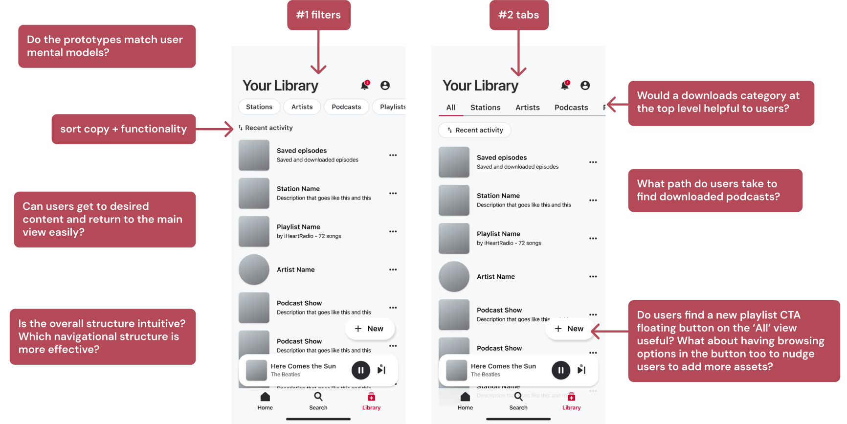
Participants took different paths to get to desired content 💭
The podcasts tab, downloads tab, episodes card, and show card were all used to reach downloaded podcasts, with 15/15 participants reporting the
task easy or very easy. This indicates that providing multiple access points is beneficial.
Recent activity was generally well-received and understood 🤓
Several participants even expressed an expectation for our particular sorting option as the default. One said, “Usually the things that are most recent
are the things you may want to continue with,” validating our hypothesis.
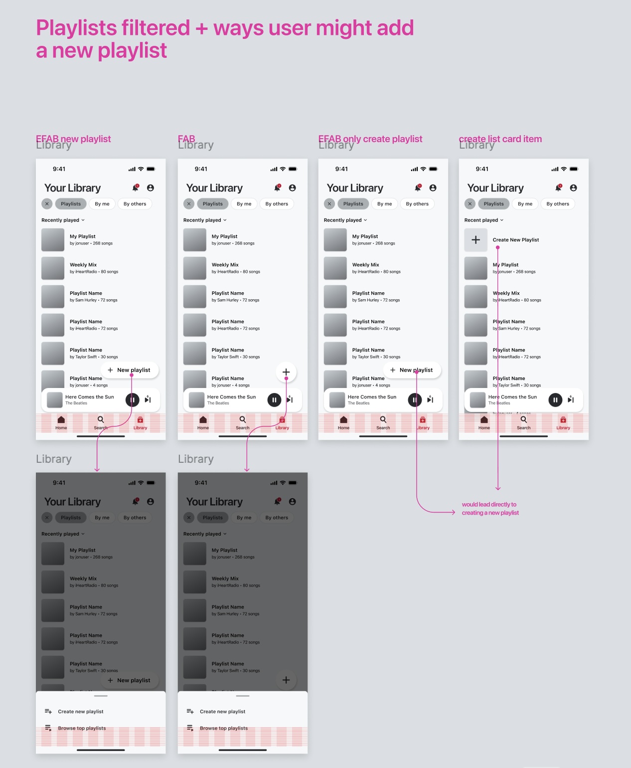
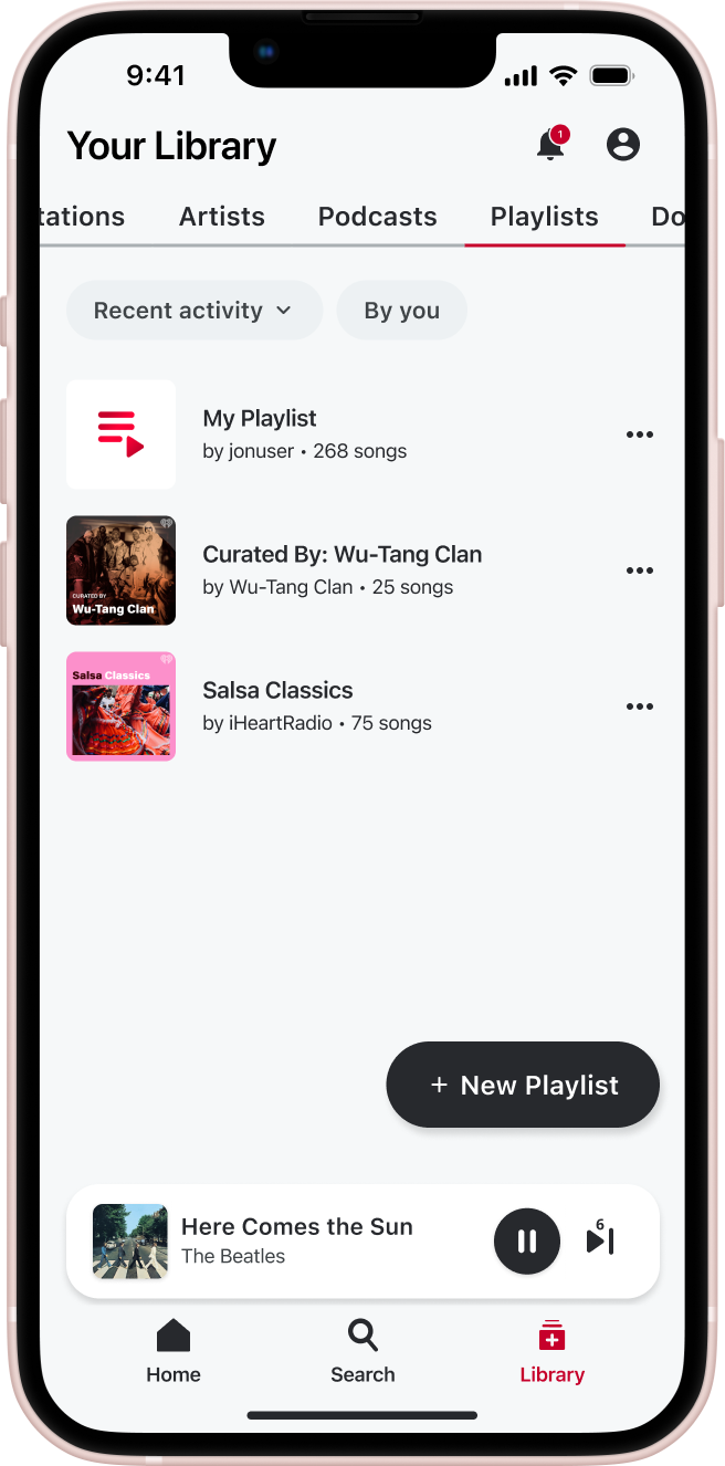
Participants enjoyed the ability to create playlists on the All view and Playlists view 👏
Participants created playlists two ways, 10/15 from the All view and 7/15 from the Playlists view (several demonstrated both), confirming that
the playlist CTA button on the All view has merit.
The browse options had mixed reception and caused confusion for many 😶🌫️
Many participants found the presence of content discovery/browse features in the floating “New” button unexpected and confusing, so we
discarded our out-of-the-box idea.
Both prototypes universally facilitated successful task completion and clearly communicated Library organization during testing. Participants described both
with words like easy to use, organized, familiar, and straightforward.
Ultimately, both models were relatively compatible with iHeart content offerings and our goals as shown by research.
However, it was important to acknowledge that controlled testing environments may not always reveal various advantages or subtleties of
how designs may perform after launch.
We thus decided to revisit the two navigation models and conduct an in-depth analysis, weighing the benefits and drawbacks of each.
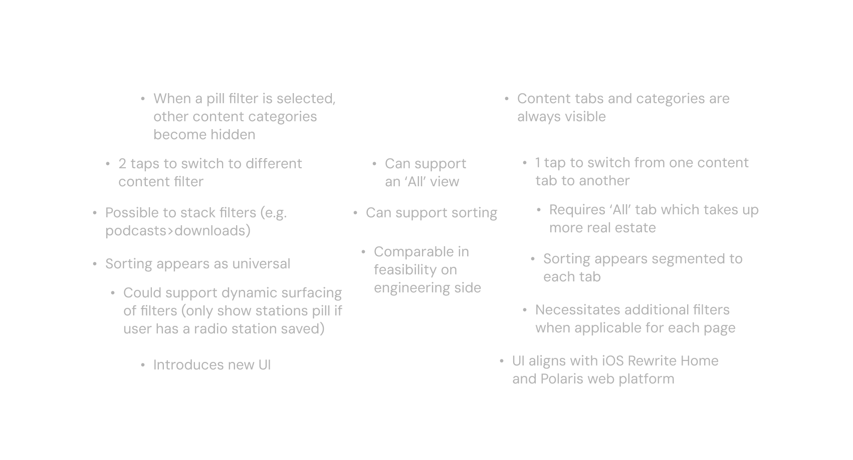
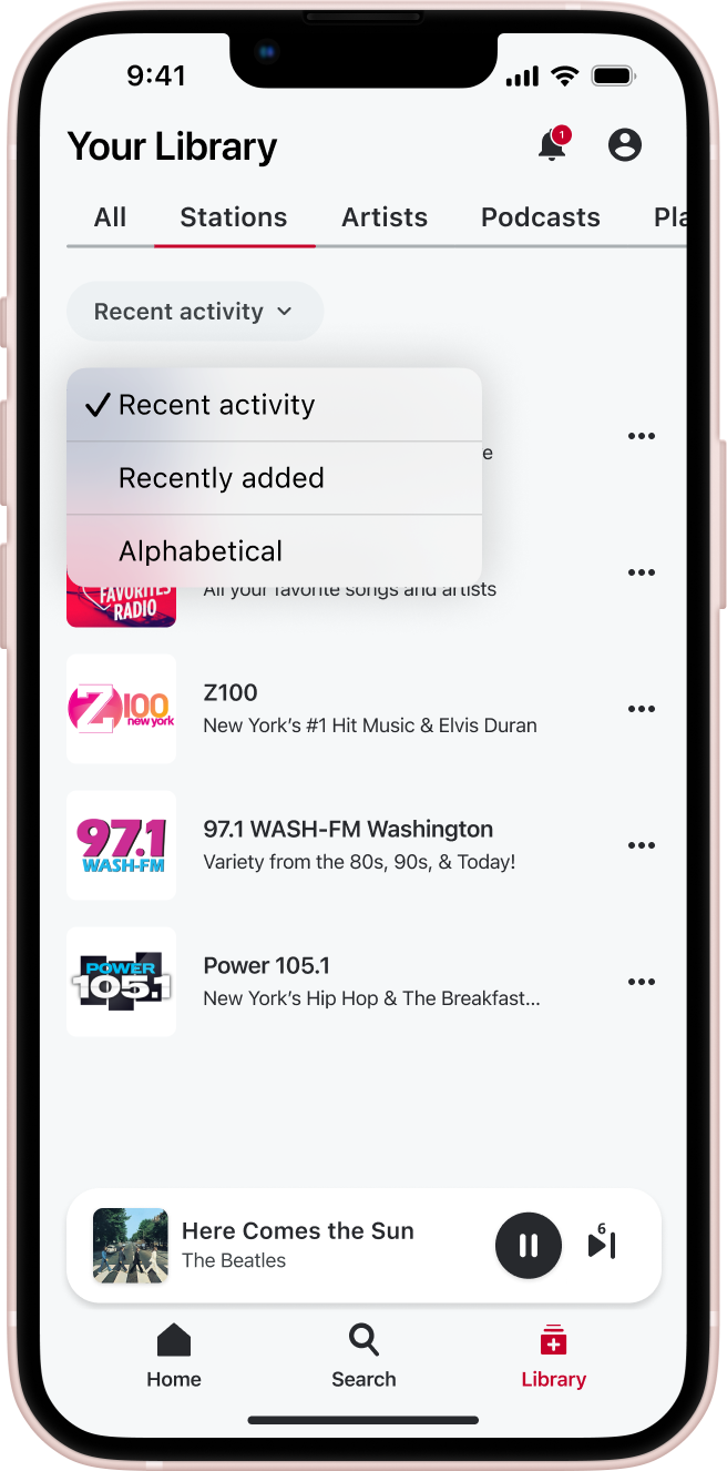
Tabs ultimately won based on our assessment of iHeart’s consumer base and their behaviors.
Our product knowledge tells us two key characteristics of iHeart’s current users:

Frequently in cars and on the go
Older demographic, not as tech-savvy
We determined the tab-based navigation would be more forgiving in various circumstances for our users. It allows you to quickly
switch between viewing content types in one tap, rather than two. Moreover, the visual constant of the content tabs
serves as user education by sectioning off Library assets to their respective sections and rendering visual changes in the content list
less jarring compared to filters.
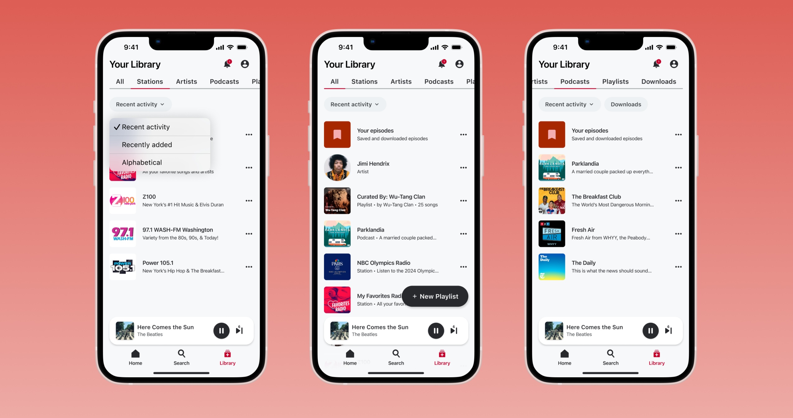
From here, we landed on a final recommendation that we were confident would support our current and future Library needs.

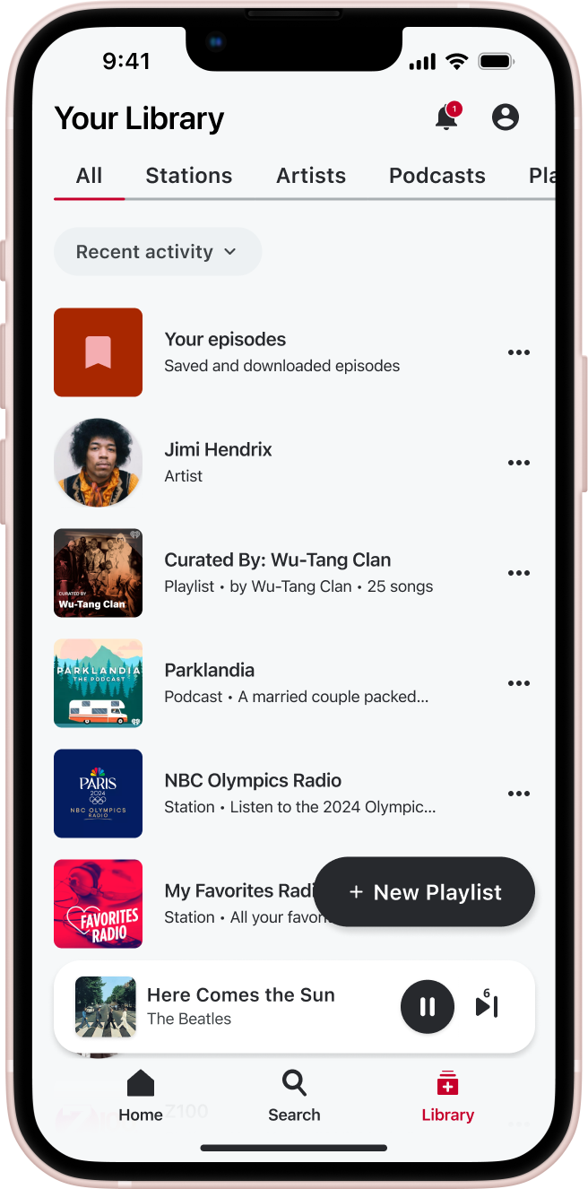
Surfacing all assets removes unnecessary barriers to content for effortless stream start. By capturing all content
regardless of type in this default view, we don't favor certain listeners over others which yields a personalized experience for all.
The floating CTA button facilitates easier playlist creation, predicted to increase listener retention.
Users can quickly switch between viewing different content types in one tap with a tab navigation. As Library scales and iHeart's user base saves more content,
this robust information architecture ensures that Library stays organized and easy to navigate.
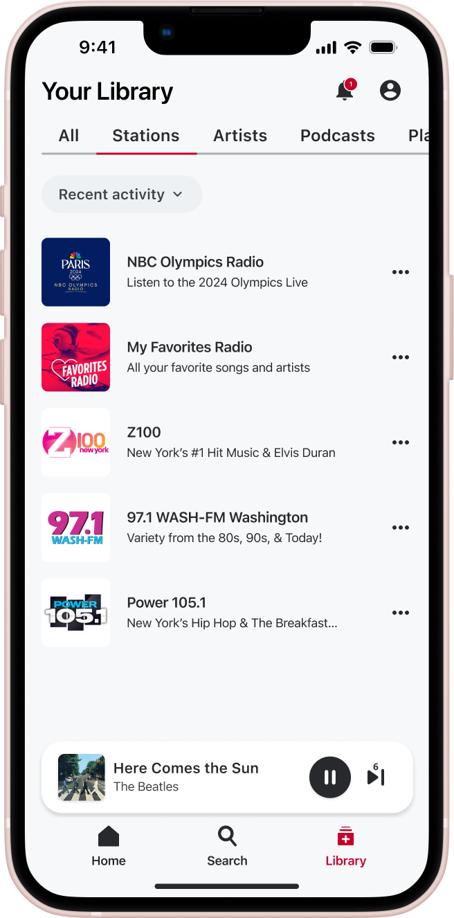
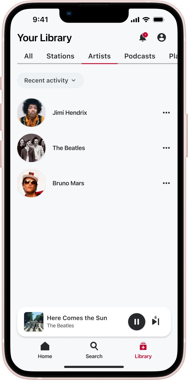
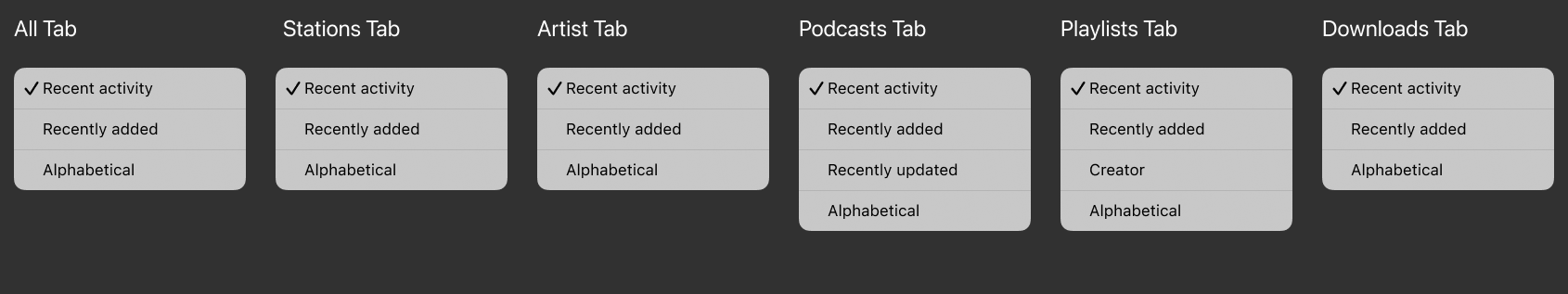
Stations and Artists are divided into separate categories—aligning with our web platform—to better fit user mental models.
Sorting gives users agency to organize their saved content as they desire and helps to surface relevant content that they are most likely to be interested in
— offering a more engaging, personalized experience.
The copy and sort options were finalized after deliberating many others like Recents, Recently played, Recently followed, etc. Our final options
captured all relevant use cases and were successful in testing.
Depending on the selected tab, users will be able to further narrow down their view with filters.
With this, we retain the current ability of viewing only downloaded podcasts or created playlists, but still introduce that content
earlier in the flow.
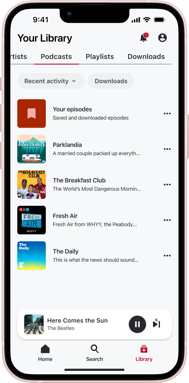
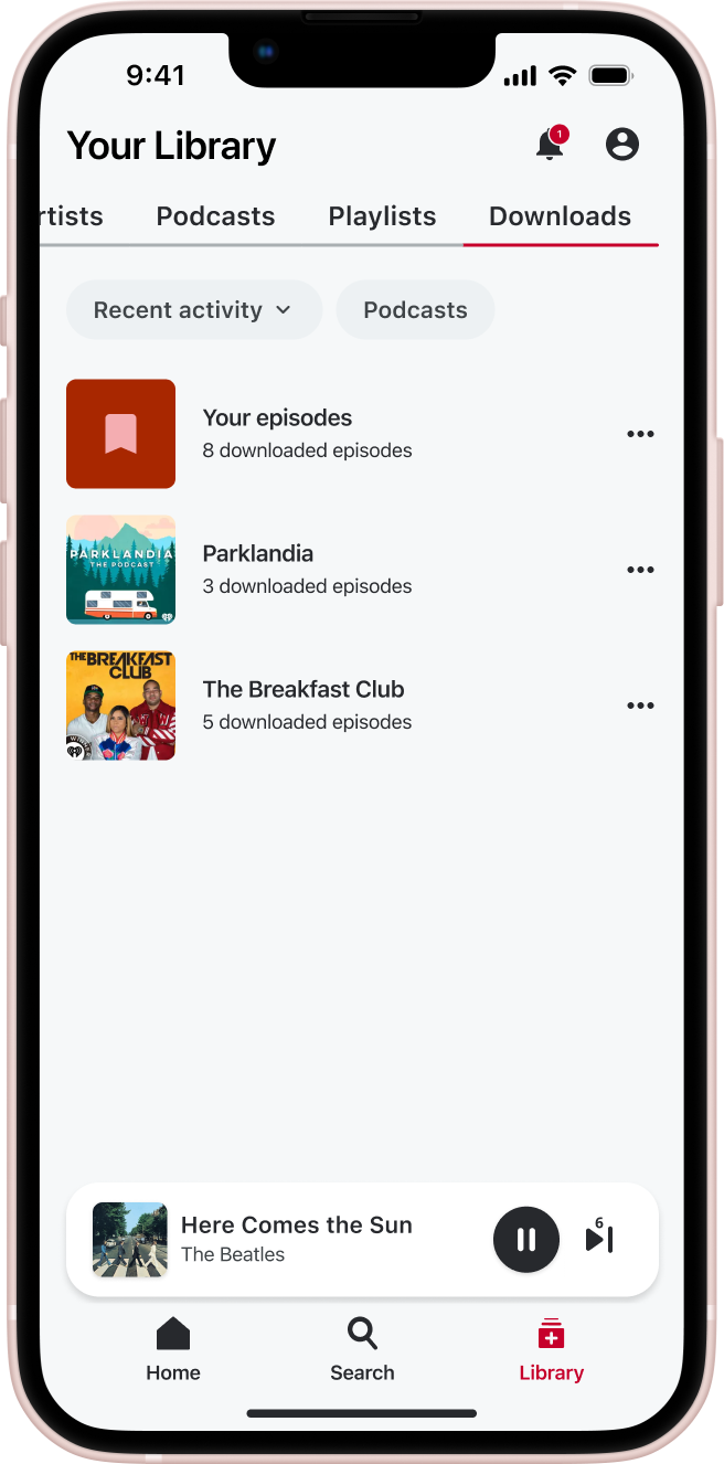
The Downloads tab makes accessing downloaded podcasts easy, and it can host multiple content types as we consider
future scaling. Premium subscription users already have the ability to download 2 content types (Podcasts, Playlists).
It also acts as a pre-selected tab for an enhanced offline experience.
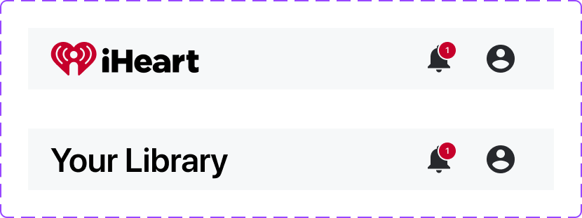
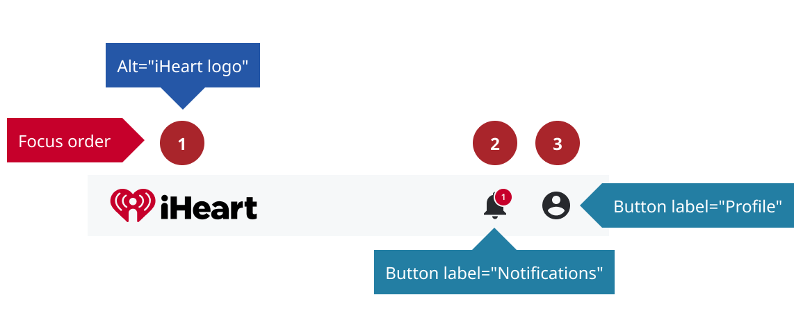
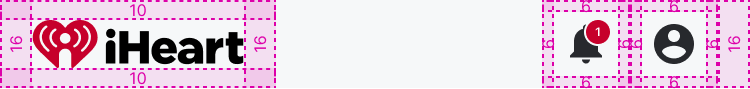
During my internship, I contributed to iHeart’s evolving design system, using Figma design tokens to create layered components with properties and variables. Below is an example of a navigation component I built (logo and text variants), accounting for responsive sizing and touch target dimensions. I also created iOS Native status bar components that can be coupled with our platform-flexible library.
We reached our final design recommendation by the end of my internship and this project is currently in development. The next
steps would be creating handoff files, working with engineering to further provide support to develop the major features
we are proposing that will impact multiple platforms. Engineering discovery sessions would be necessary to specify technical aspects
of the experience (offline experience, refresh frequency, overflows, etc).
We would also prioritize working with analytics and product to implement a data tracking infrastructure for Library so that we can not
only measure the success of this Library initiative but also monitor and improve the product for the future.
I learned a lot about product design and management throughout the course of this project. Beyond gaining technical
skills, I collaborated with many teams and people in my research process. Presenting my designs frequently refined my
ability to explain my decisions, answer to different stakeholders, and think more critically about my work.
I also experienced operating in ambiguity. In my research process, I faced constraints such as the lack of data tracking within
our current Library. Despite that, I learned how to capitalize on other the resources at our disposal to make informed design
decisions.
Huge thank you to the iHeart digital product team, the UX team, and stakeholders for giving me the opportunity
to work on this impactful initiative.